When it comes to building a beautiful website, images play one of the biggest roles. They grab attention, create emotion, and help tell your brand’s story.
But here’s the tricky part — if your image dimensions are wrong, your site can load slowly, look blurry, or appear stretched on different devices.
That’s why choosing the right image dimensions for web design is so important. In this guide, we’ll explain what dimensions mean, how to pick the right sizes for each use, and some best practices to make your site look sharp and load fast.
What Are Image Dimensions?
Image dimensions refer to the width and height of an image, usually measured in pixels (px).
For example:
- 1920×1080 px → full HD image
- 800×600 px → medium-size image
The larger the dimensions, the higher the resolution — but also the larger the file size.
That means if you upload huge images (like 5000px wide), your website will load slower — especially on mobile.
So, finding the right balance between quality and size is the key.
Why Image Dimensions Matter for Websites
Using proper dimensions can completely change your site’s performance and appearance. Here’s why it matters:
- Faster Page Loading:
Smaller images load faster, improving user experience and SEO rankings. - Better Quality Display:
Correct dimensions prevent images from appearing pixelated, stretched, or blurry. - Consistent Design:
Having a standard image size keeps your website layout clean and balanced. - Responsive Design:
The right sizes ensure images look perfect on all screens — desktops, tablets, and mobiles. - SEO Optimization:
Search engines prefer lightweight, optimized images that improve page speed.
Common Image Dimensions for Web Use
Here’s a simple breakdown of standard image dimensions for different areas of a website:
| Image Type | Recommended Dimensions (px) | Notes |
|---|---|---|
| Website Header / Hero Image | 1920 × 1080 | Large, full-width display image |
| Banner Image | 1600 × 500 | Wide banner for top or mid-page sections |
| Slideshow / Carousel | 1200 × 600 | Medium width; looks good on most screens |
| Blog Post Featured Image | 1200 × 630 | Perfect for sharing on social media |
| Thumbnail Image | 400 × 400 | Used for previews or gallery grids |
| Content / Inline Image | 800 × 600 | Ideal for articles and posts |
| Background Image | 1920 × 1080 | Should be large but optimized |
| Logo | 250 × 100 | Keep it sharp and minimal |
| Favicon | 32 × 32 | Tiny icon for browser tab |
| Product Image (eCommerce) | 1000 × 1000 | Square, detailed image |
| Gallery Image | 1200 × 800 | Balanced for both detail and speed |
These are just guidelines — you can adjust based on your layout or theme, but staying close to these ensures a consistent and responsive result.
How to Choose the Right Dimensions
Here’s how to decide what image dimensions work best for your site:
1. Understand the Image’s Purpose
Ask yourself:
- Is it a background image or main feature?
- Will it appear full width or in a small card?
Example:
A hero section image can be 1920px wide, but a small sidebar image doesn’t need more than 400px.
2. Check Your Website Layout
Different website builders (like WordPress, Wix, or Webflow) have different section widths.
If your page layout has a maximum width of 1200px, there’s no need to upload an image larger than that.
3. Always Use High-Quality Source Images
Start with a high-resolution image and then resize it down — not up. Upscaling an image reduces sharpness and causes blurriness.
4. Optimize for Retina Displays
Modern devices (like MacBooks and iPhones) have high-density screens.
To make your images look sharp, save them at 2x the display size (e.g., 600px displayed → upload 1200px version).
Image Formats & When to Use Them
Choosing the right file format is just as important as size.
Here’s a quick cheat sheet:
| Format | Best For | Advantages |
|---|---|---|
| JPEG (.jpg) | Photos, banners, blog images | Small file size, good quality |
| PNG (.png) | Logos, transparent images | High quality, supports transparency |
| WebP (.webp) | All types | Modern format with excellent compression |
| SVG (.svg) | Icons, logos, vector graphics | Scales infinitely, super lightweight |
| GIF (.gif) | Simple animations | Use sparingly; large file sizes |
Pro Tip: Use WebP format whenever possible — it offers the best quality-to-size ratio and is supported by most modern browsers.
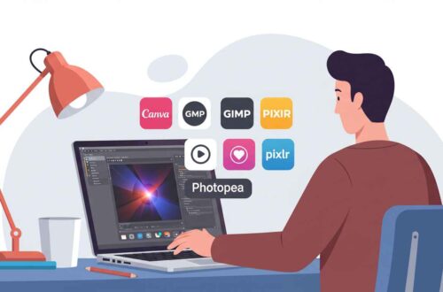
Tools to Resize and Optimize Images
You don’t need Photoshop to resize or compress images.
Here are free online tools that make it simple:
- TinyPNG → compresses PNG/JPEG images
- ILoveIMG → resize, crop, and compress easily
- Squoosh.app → from Google; optimize images manually
- Canva / Pixlr → adjust size and resolution visually
- Convertio / CloudConvert → change formats (e.g., JPG → WebP)
Make sure to compress images before uploading — you’ll save space and speed up load times dramatically.
Responsive Image Tips
Websites today need to look perfect on every screen — from big desktops to tiny phones.
Here’s how to handle images responsibly:
- Use Relative Units (like %) Instead of Fixed Pixels:
This lets images automatically resize based on the device. - Use the
<picture>orsrcsetTag (for developers):
This HTML feature tells the browser which image size to use based on screen width. - Check Mobile View:
Always preview your site on mobile before publishing — make sure images aren’t cropped awkwardly or loading too large. - Lazy Load Large Images:
Use lazy-loading plugins or built-in features so images load only when they appear on screen.
Example: Ideal Setup for a WordPress Blog Post
Let’s say you’re publishing a post with images in WordPress.
Here’s the perfect setup:
- Featured Image: 1200×630 (JPEG or WebP)
- Inline Image: 800×500
- Thumbnail: 400×400
- Compress with: TinyPNG or ShortPixel plugin
Your post will look professional, load quickly, and share beautifully on social media.
Common Mistakes to Avoid
- Uploading huge 5MB+ images directly from your camera
- Using random image sizes across your site
- Forgetting to compress before uploading
- Ignoring mobile responsiveness
- Cropping images inconsistently
Remember: every extra second of loading time increases bounce rate — so optimization is not optional anymore.
Final Thoughts
Choosing the right image dimensions for web design is about balancing visual quality and performance.
The right size keeps your site looking professional, loads quickly, and provides a better user experience.
Here’s the golden rule:
“Big enough to look sharp, small enough to load fast.”
Once you understand how dimensions work and follow best practices, your website will not only look stunning but perform perfectly on every device.