If you’re creating YouTube videos, blog graphics, or social media posts, one thing is certain — your thumbnail can make or break your click rate.
A thumbnail is often the first impression viewers get before deciding to click. And the secret to an irresistible thumbnail lies in the perfect combination of fonts and images.
In this article, we’ll explore the best font and image combinations for thumbnails, how to pair them smartly, and what tools you can use to make them stand out effortlessly.
Why Font & Image Pairing Matters
Think of your thumbnail as a movie poster for your content.
It needs to do three things instantly:
- Grab attention.
- Communicate what your content is about.
- Trigger curiosity or emotion.
Fonts tell your audience how to feel, while images set the context. When they work together in harmony, your thumbnail looks professional, trustworthy, and clickable.
The Psychology Behind Great Thumbnails
A great thumbnail doesn’t just look good — it communicates visually in a fraction of a second.
Here’s what happens when someone scrolls:
- The image catches their eye.
- The font communicates the message or tone.
- The colors trigger emotion.
For example:
- Bold sans-serif fonts + expressive faces → work great for reaction videos.
- Clean serif fonts + minimal backgrounds → ideal for educational content.
- Playful handwritten fonts + colorful backdrops → perfect for DIY or lifestyle videos.
Understanding this visual psychology helps you design more effectively.
1. Bold Font + Expressive Portrait Image
Best for: Reaction, commentary, or entertainment thumbnails
Font examples:
- Impact
- Anton
- Bebas Neue
- Oswald
Image style:
Use a close-up portrait of a person with a visible emotion (surprised, happy, shocked). The face should be large and well-lit, with a blurred or color-tinted background for focus.
Why it works:
Bold fonts add power, while expressive faces catch emotion instantly. Together, they create an attention-grabbing combo that performs especially well on YouTube.
Pro tip: Add a soft shadow or outline behind the text to make it pop against the background.
2. Handwritten Font + Product or Object Photo
Best for: DIY, craft, art, or lifestyle content
Font examples:
- Pacifico
- Lobster Two
- Amatic SC
- Dancing Script
Image style:
Use bright, colorful images of hands, crafts, tools, or lifestyle setups. Ensure the background is clean so the font remains readable.
Why it works:
Handwritten fonts feel personal and friendly. Combined with everyday imagery, this pairing gives warmth and authenticity — ideal for tutorials or handmade projects.
Pro tip: Use subtle pastel backgrounds for a cozy, inviting vibe.
3. Modern Sans-Serif Font + Minimal Background
Best for: Technology, productivity, and design tutorials
Font examples:
- Poppins
- Montserrat
- Roboto Bold
- Lato Black
Image style:
Use abstract backgrounds (like gradients or geometric patterns) or minimal product shots (laptop, workspace, etc.).
Why it works:
Modern sans-serif fonts are clean, bold, and professional. Paired with minimal images, they communicate clarity — perfect for tech or software thumbnails.
Pro tip: Use bright color contrast (like white text on a dark gradient) for an ultra-modern feel.
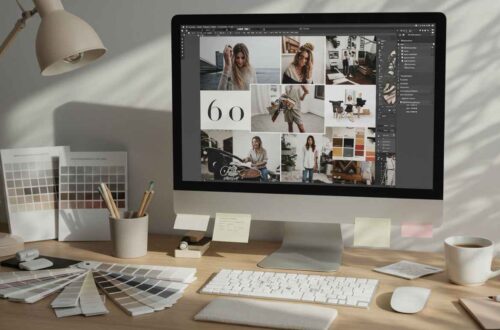
4. Serif Font + Aesthetic Lifestyle Image
Best for: Fashion, travel, food, and photography content
Font examples:
- Playfair Display
- Cinzel
- Libre Baskerville
- Cormorant Garamond
Image style:
Use soft-toned, high-quality lifestyle images — beach views, food flat lays, or travel portraits.
Why it works:
Serif fonts bring elegance and class. When paired with beautiful imagery, they make the thumbnail look editorial, professional, and calming.
Pro tip: Use semi-transparent overlays behind the text to maintain readability.
5. Funky Display Font + Dynamic Action Image
Best for: Gaming, sports, and entertainment content
Font examples:
- Bangers
- Luckiest Guy
- Press Start 2P
- Anton Extra Bold
Image style:
Use high-energy action scenes — characters mid-movement, explosions, racing, or bright colors.
Why it works:
Funky display fonts convey excitement and motion. Paired with energetic imagery, this combination is perfect for high-action thumbnails that need to grab attention fast.
Pro tip: Use outlines and neon glows to make your text pop on dark or chaotic backgrounds.
6. Minimal Font + Abstract Color Background
Best for: Motivational or quote-based posts
Font examples:
- Raleway
- Nunito
- Josefin Sans
- Avenir Next
Image style:
Simple abstract backgrounds or gradient shades (like blue to purple or orange to pink).
Why it works:
Minimal fonts keep your message readable, while gradients and soft patterns create visual appeal without distraction.
Pro tip: Center-align your text and keep your message short — 4 to 6 words max.
7. Block Font + Collage or Split Background
Best for: Comparison or tutorial videos (e.g., “Before vs After,” “This vs That”)
Font examples:
- Oswald
- Roboto Condensed
- Bebas Neue
- Exo 2
Image style:
Use a split-screen or collage layout — half showing one version, half the other.
Why it works:
The blocky text adds structure and power, while the dual image layout visually represents contrast — perfect for educational or transformation content.
Pro tip: Add a diagonal or vertical divider line between images to make the split clearer.
8. 3D or Shadow Font + Transparent Cutout Image
Best for: YouTubers and influencers
Font examples:
- League Spartan (with shadow)
- Luckiest Guy (3D style)
- Anton Outline
- Archivo Black
Image style:
Cutout the subject (you or the product) and place it over a colorful or blurred background.
Why it works:
This modern style mimics professional YouTube thumbnails. The 3D or outlined font adds depth and energy, while the cutout image ensures focus stays on the subject.
Pro tip: Use subtle shadows and bright accent colors for a polished look.
9. Bold Font + Patterned Background
Best for: Educational reels, infographics, or announcements
Font examples:
- Futura Bold
- Archivo Black
- Proxima Nova Extra Bold
Image style:
Use geometric, striped, or textured patterns as background (keep opacity low for readability).
Why it works:
Bold fonts cut through visual noise, while patterns create an eye-catching, professional appearance.
Pro tip: Stick to 1–2 colors max — too many can make it feel chaotic.
10. Playful Font + Cartoon/Illustration Image
Best for: Kids, humor, or animated content
Font examples:
- Comic Neue
- Chewy
- Bubblegum Sans
- Fredoka One
Image style:
Use colorful illustrations, doodles, or cartoon characters.
Why it works:
Playful fonts match fun, animated imagery — instantly appealing to kids or casual viewers.
Pro tip: Keep text thick and colorful for maximum impact on mobile screens.
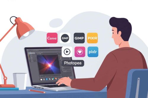
Tools to Try for Easy Font + Image Pairing
If you want to experiment with combinations, here are the best free tools:
- Canva: Offers hundreds of ready-made thumbnail templates.
- Fotor: Great for photo editing and quick text overlays.
- Pixlr: Free online image editor with font effects.
- Snappa: Specialized templates for YouTube, Facebook, and more.
- Crello (VistaCreate): Awesome for animated thumbnails.
All these tools let you test how fonts look over different backgrounds instantly.
Final Thoughts
The best thumbnails blend clarity, creativity, and consistency.
Your goal should always be:
“Can someone understand what my content is about — even if they don’t read the title?”
Choosing the right font + image combination helps you answer that with a yes.
Experiment with styles, keep your branding consistent, and always check how your thumbnail looks on both desktop and mobile screens.
Over time, you’ll develop your own “signature style” that makes people recognize your content at a glance.